So how does a charity like ours afford such a fantastic new website such as this? Early-stage testing shows that the community here finds it easy to navigate and clear. But people might understandably wonder how much it has cost and whether the funds might have been better spent elsewhere.
Time to review things
Our old website was created when CCDT was founded in 2009. The website and the look and feel of the ‘brand’ for Chichester Community Development Trust worked well in the start-up phase of the organisation. However, when we undertook a strategic review in 2014, we recognised that in order to achieve our goals for the next 10 years, we needed to clarify the messages and key calls to action, engage the community further and build support, and tell our story in a clear way so that it was truly accessible to all.
‘Hard to Navigate’ ‘Expensive’
Feedback about our old website was that it was hard to navigate and left some folks unsure about what we do and how we work with the community to make changes. But we had greater problems than this! The website didn’t offer us much room for change or development, and cost a lot to maintain.
Finding the funding
So we applied very specifically for a grant from the Lloyds Bank Foundation to improve our infrastructure (we also had some archaic IT systems in place and didn’t even have the capacity to share work diaries!) and future-proof the organisation ready for its ever-increasing workload…
And we got the news in January 2015 that we had been awarded these funds. A HUGE thank you to the Lloyds Bank Foundation.
Word press website works for us
The funds enabled us to engage a local graphic designer and web developer who understood our vision and was able to provide a new direction for CCDT. And one of our favourite outcomes? The designer has created for us a word press website … nice, long-lasting, cheap, easy to maintain and keep up to date! No more bills for every change we wish to see on the website!
Local designer vs the design agency
The benefit of working with a small independent designer locally, rather than a large design agency, not only allowed us to support a local business, but also offered excellent value for money. A further contractor was appointed to deliver a marketing strategy for CCDT and to work to develop the brand and content for the new website… and you may well have noticed a change in our Facebook and Twitter feeds too. And talking of future-proofing, our staff and volunteers are being trained up so we can take over in due course.
The new brand and logo was rolled out in September 2015 and we have had great feedback from the community, stakeholders and partners and we are beginning the process of re branding our flyers, marketing materials and documents. We hope that the new look will be in place in all that we do for the start of 2016.
Making it work
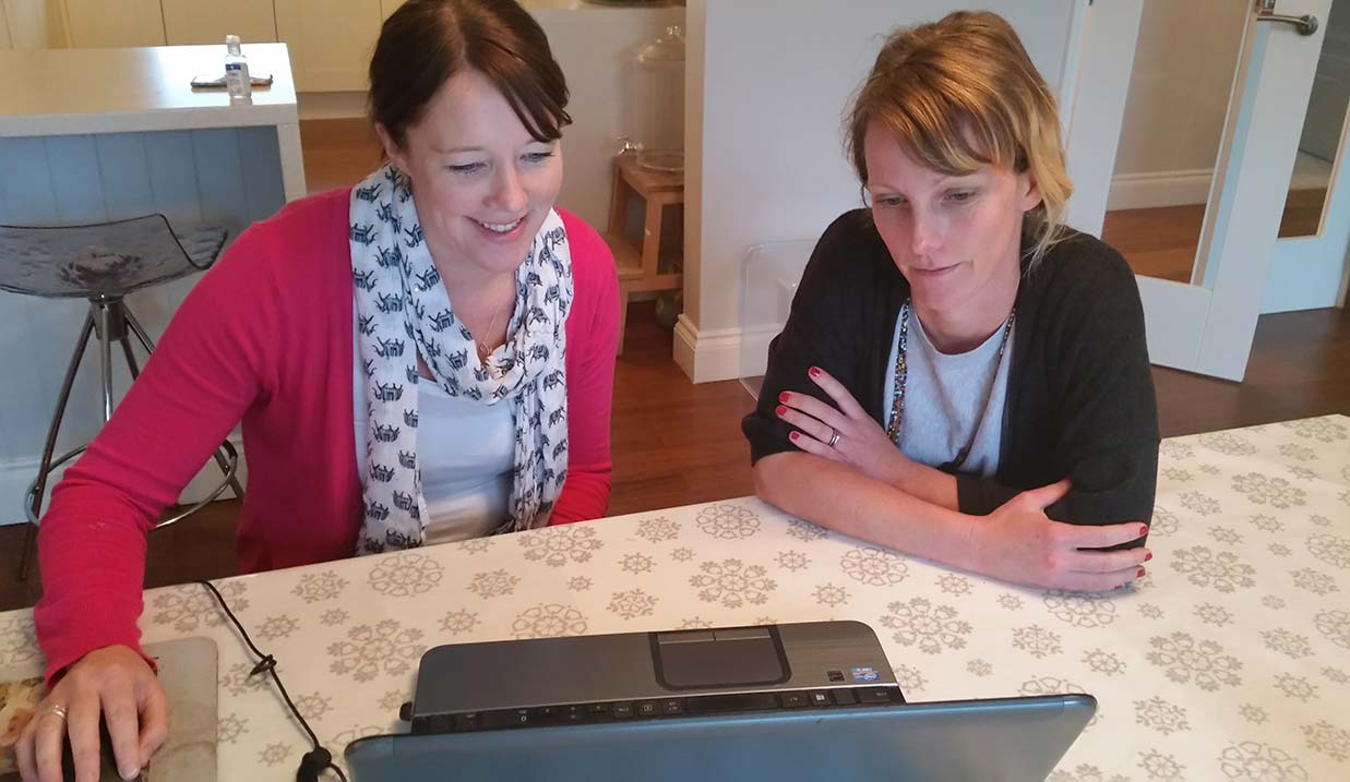
Our small team has been working closely with residents and stakeholders to develop the brand and the website and have spent many hours getting the site ready for use. We wanted the site to be fresh and innovative, with plenty of images, and to represent fully what we do.
[unordered_list style=’circle’ number_type=’circle_number’ animate=’no’ font_weight=”]
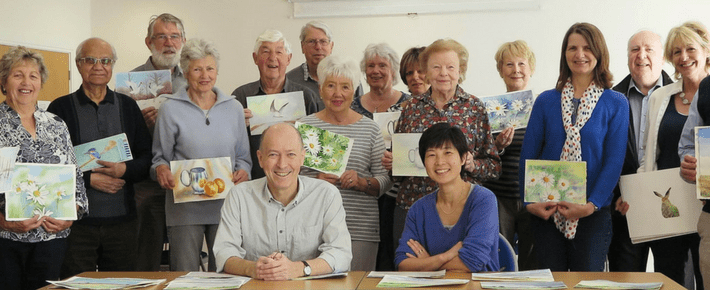
- The What’s On page is key: visitors can see the full range of activities on offer and get involved (this was not possible on our original site).
- Bringing our venues for hire to the fore: this new site gives clear information on each venue, brochures to download, links to map showing public transport options and an easy way to enquire or make a booking. Without doubt this will help our bookings administrator and save time.
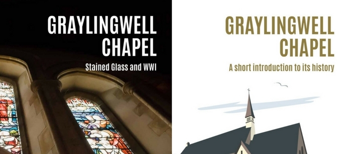
- Other new sections include: ‘meet’ our staff team, read about CCDT’s history, identify the key work areas and download key documents.
[/unordered_list]
Here’s to 2016
We are very excited to start 2016 with a new look, brand, website and a fresh take on social media. CCDT is growing and learning all the time and we are now in a position to take on additional buildings and community projects in the knowledge that we have a new site and brand that will grow with us and represent our offer. A massive thank you to the Lloyds Bank Foundation for funding this project, to Lina Poskitt of Silverdoodle from for the excellent brand and web design and Laura Kameen for the inspiring marketing development and support – we are thrilled with the results and hope you are too.
